How do you know what to capture? Graphic Recording’s Order of Operations
There’s something of a protocol to sketchnoting and graphic recording. Think of it like the order of operations in math.
1️⃣Text
2️⃣Drawing
3️⃣Color, containers, & connectors
1️⃣ Text comes first
When you hear something worth capturing, write it down. When someone says:
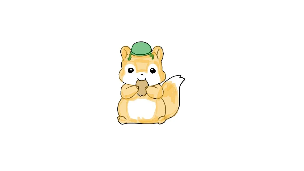
“Our country is experiencing an unprecedented invasion of common brown squirrels.”
You write: Squirrel Invasion!
Write down ideas first so that you don’t have to remember them later. Text is your net for catching ideas before they scurry away.
2️⃣ Then, drawing
As the speaker expounds into the details of why squirrels are invading, veering into content not worth capturing, you can move to illustration. Pull out your phone, search for a quick squirrel cartoon as a reference, and add an army helmet, a parachute, make it look like a Red Dawn movie poster. The drawing becomes a mnemonic for the concept: a memory anchor that makes the idea more sticky.
Go back and forth between text and drawing. The speaker says, "But the good news is, we have the solution at our fingertips! Squirrel breeding habits are disrupted by the noise and exhaust of gasoline-powered lawn mowers." So you write "Solution: Lawn Mowers!" And as the speaker expounds, you draw a giant lawnmower chasing down hapless squirrels, reminiscent of a scene in Lawnmower Man.
3️⃣ Finally, add color, containers, and connectors
And as the speaker continues to expound and goes too deep into detail for meaningful capture, you can:
add color to your drawings,
wrap the key images with containers like boxes, bubbles, or clouds, and
join them together with connectors, like arrows or dotted or solid lines.
Color, containers, and connectors provide good layout and flow to the chart, making the content easier to navigate and read.
But how do you know what’s worth capturing?
There are lots of ways of knowing, but here’s four easy ways to be sure what you’re capturing is relevant.
It’s on the slide. This is easy mode: if it’s on a PowerPoint, it’s fair game.
The speaker emphasizes it. Watch their tone of voice, gestures, body language, and expression. If they get excited, capture it.
It’s the thesis. These are the phrases that introduce what follows or recap what came before. It’s the thesis statement, the summary, and the so what.
The client told you it was important. During your discovery and design, ask “What’s most important for me to capture?” Their answers may surprise you. What sounds important to you may not be important to them.
Graphic recording isn’t about drawing beautifully; it’s about listening beautifully. Follow the order: Text → Drawing → Color/Containers/Connectors and focus on what matters most.
🎯 Your visuals don’t have to be perfect. They just have to work.
What’s your go-to trick for deciding what to capture in a meeting or presentation?